
Wireframes for a Volunteer Management System
GOAL
To create a multi-page web app wireframe prototype designs based on feature requirements. The main goal was to give the client ideas for the UI/UX design. Therefore this was a completely creative project and one could explore various layouts and iterations.
TIMELINE
June – July 2019
PROCESS
A kick-off call where I discussed the concept with the client. Discussed the various feature requirements provided in a document to understand the goal of the app, the problem it will solve and the kind of users it will cater to. The client also discussed some of the ideas, user flows and references they had in mind.
Organized weekly calls with the client to update them on the process, discuss questions and brainstorm on the critical problems related to the features required.
MY ROLE
Understood the requirements from the client. Worked on a home page and sign up flow keeping in mind the amount of data that needs to be collected while still keeping the flow user-friendly. Worked on three dashboards for three different stakeholders. Identified the various sections, the inputs that needed to be collected from the user, and other actions that they could take. Sketched out wireframe ideas on paper before moving to Figma to create the wireframes. Interlinked the wireframes to create a prototype to give a better sense of how the flow of the entire web app will work.
Landing Page
I also chalked out the various sections of the homepage that needed to convince users to sign up for the product. The page introduced the concept of the web app, highlighted the benefits for each type of stakeholder, included Call-to-actions to sign up or find out more details, presented validation through testimonials and organizations that were using the app. The landing page also included screenshots of the dashboards to show the users what to expect once they sign-up.
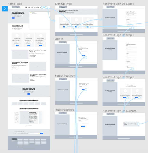
Sign Up Flow
The sign-up process needed to collect a fair amount of information from the user. The challenge here was to identify the most critical information, keep the user interested so that they do not abandon the sign-up process.
The initial signup process was coming to be around 10 steps, which I thought was too many and increased the chances of drop-offs. I suggested that on sign up we collect the bare minimum information required to verify an account and then have a “getting started” flow on the first login.
The overall flow would then be:
Sign Up > Verification > Get Started (Account Set-Up) > Dashboard
I implemented this revised flow after discussions with the client.


Recognition over recall
Part of the Getting Started flow required to collect various types of information. Rather than letting the user think about these types of inputs, such as types of skills, I suggested we go with a recognition over recall approach where we present the user with options to choose from. This would allow for easier and faster input from the user while reducing cognitive load.

Wireframes and Prototyping
Based on the requirements document and discussions with the client, I created wireframes and prototype for the homepage, sign up flow, sign in and forgot password flow, three dashboards with various features such as inviting new members, setting up a public page, profile and settings section, events section and more.
SUMMARY
In conclusion, I successfully delivered a clickable prototype to the client in Figma after brainstorming and iterations. I addressed the challenges of keeping the flow user-friendly and reducing cognitive load. I took into account the client’s feedback and incorporated them into the final output.
REFERENCE
Nate Jones
najones@lnketech.com