GOAL
EZDynamic is a boutique management consulting firm with an entrepreneurial spirit driven by results. They provide client-centric solutions for Financial Services firms, helping them achieve their business, strategic, and technology goals.
EZDynamic required a complete redesign of their brand and a new succinct website with an easy-to-read value proposition. They were looking for a clear, streamlined design without a lot of clutter but at the same time showing the dynamic nature of consulting through clean visual effects. The brand needed to communicate innovation, strategic approach, and dynamically delivered solutions. The website needed to include content that their audience would find useful and informative with an easy way for them to get in touch. The client also required a clean CMS that allowed them to manage their website easily.
TIMELINE
March – May 2021
PROCESS
Weekly calls with the client were set up, the client was in a different time zone than me and my team. Each week we would identify the tasks to work on for that week. All files were shared through GDrive and Figma was used throughout the web design process to collaborate easily.
MY ROLE
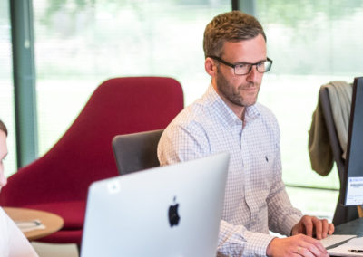
My responsibilities were to communicate with the client, keep the project on track, manage the team and resources, and lead the design direction of the project. My team included a graphic designer, UI designer, front-end developer, and back-end developer.
Logo
We started out by researching the visual directions that the brand could go in. We put together reference logos, both from the client and our own research. After expanding our view, it was time to narrow it down to the ones that best highlighted the brand’s values of dynamism, strategy, and innovation. Based on these we designed the initial logo sketches. We went back and forth with the client on these for two rounds of iterations based on feedback.
My role was to translate the client’s brief into visual references for the graphic designer. Based on the values and keywords the client wanted to focus on, I used color psychology and design principles to steer the design in the right direction.
Style Guide
With the logo in place, the next step was to work on the style guide. A style guide is meant to set the tone for the look and feel of the website. Defining the typography, colors, iconography, and imagery, it’s meant to serve as the visual backbone of the website.
As my designers worked through this, my role was to help guide them through references, help finetune the type scale for the web, tweak colors so that they are harmonious. I also helped the client visualize how these elements would translate into a website design.

Wireframes
Since the website needed to be designed from scratch, we started out by identifying the information architecture and how content will be structured on the website, and what the functionality requirements were. The wireframes act as a skeleton layout of the website. They include how the content will be laid out, where images will be placed and we prototyped these wireframes to see how the pages will interact with each other. We worked with the first draft of the actual content that would end up on the site which gave us better control over what the website layout needs to be.
My role here was to discuss the labels with the client, define how the navigation will work and what functionalities would be required. I then communicated this with my design team, who put together the wireframe, providing feedback and helping get the files ready for presentation. I then helped incorporate the client’s feedback and justify certain design decisions.

Mock Up and Prototype
We used Figma to then apply the style tile to the wireframes and generate fully prototyped mockups. During this process, we made tweaks to the layout and menu structure as needed. Using the style tile helped make sure that we kept the branding consistent across the entire site.
Prototyping and linking all the mockups gave the client an idea of how the website would work in the real world. It also informs the development team about the functionality of the website.
This was particularly helpful in communicating how the form would work since certain fields’ appearance was dependent on other fields. It also helped communicate the functionality for how jobs will be dynamically listed.
Throughout the project, I made sure to keep the developers involved in the design process to make sure that all the functionalities we were imagining were feasible and achievable within our scope and budget for the project. This also gave them time to do any research and prepare for development while the design was being put together.

Development & SEO
Once the mockups were approved, it was time to get the development started. We built the website on WordPress using the Divi Builder. Our streamlined process made sure the handoff to the design team was smooth and SEO best practices were followed while developing the site.

Launch and Training
After a few rounds of testing amongst the team and the client, the site was ready for launch. SEO plugins were installed and Google Analytics was set up. The site was indexed and sitemaps submitted. We wrapped the project up by onboarding the client onto the CMS with training videos on how to manage the content and add new content as the site grows.
SUMMARY
EZDynamic is a management consulting firm that needed an innovative and dynamic brand and website design. Their target audience is decision-makers at financial firms. The logo was designed using bold colors and structured shapes that overlap. Style tiles, wireframes, mockups, and a prototype were created through the website design process. The website was developed on WordPress using the Divi Builder and best practices for SEO were followed.
Take a look at the EZDynamic’s website here